")


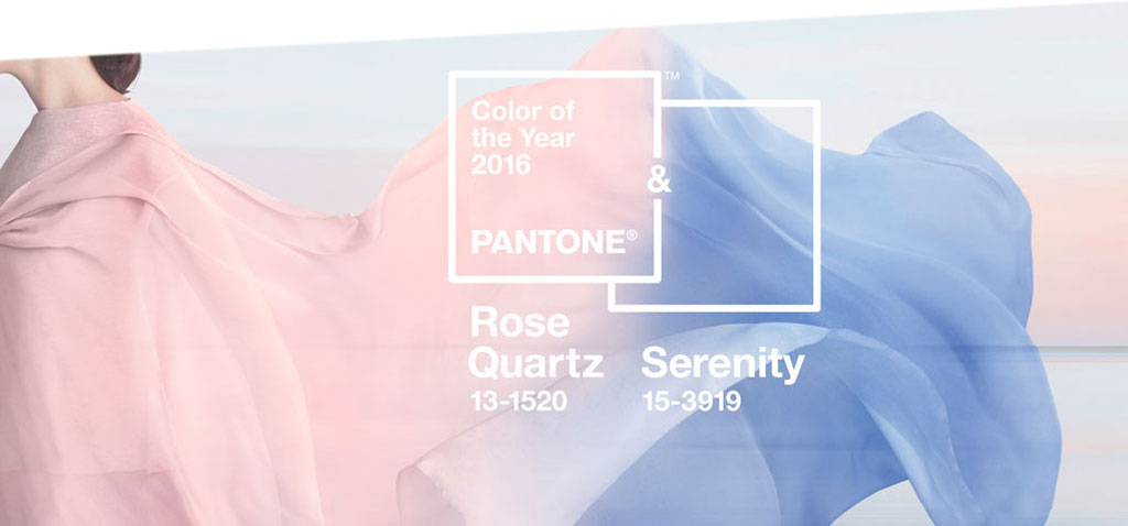
PANTONE has decided, 2016 will come with a softer take on colour and sugary tones. As every year, the US-American colour institute translates social and cultural streamings and the current zeitgeist into colours and this year PANTONE has even chosen two of its favourites as the PANTONE of the Year. The blending of two shades – rose tone Rose Quartz and a cooler tranquil blue called Serenity – is of symbolic value, the experts say; first in the light of modern day stresses as consumers seek a way to calm down and second, as the combination also challenges traditional gender perceptions and common perceptions of color associations. Indeed, the mix of the two colours appears challenging as they occasionally resemble a mix of candy from lotusland, but also on their own, the two can definitely show off.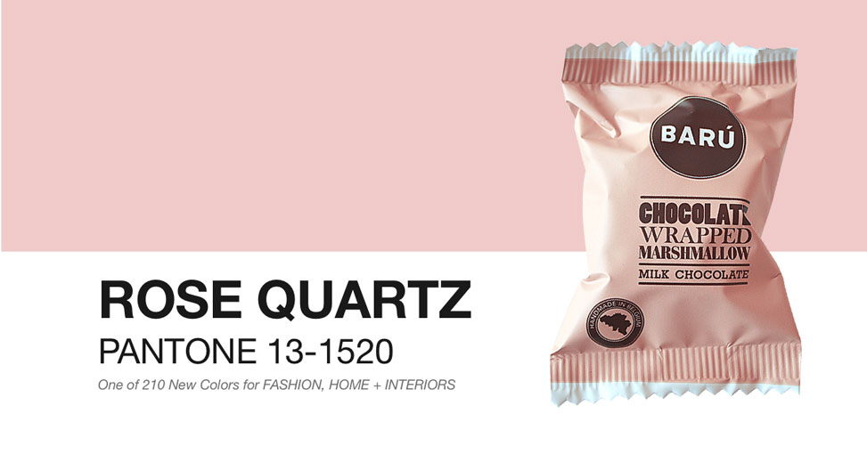
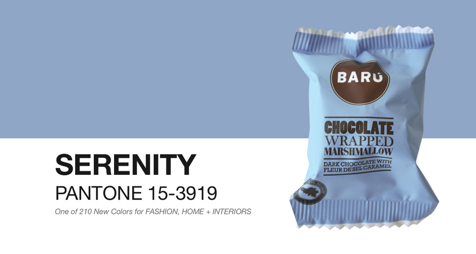
In fashion, Rose Quartz and Serenity are already a permenant feature and also in packaging the two colours cut quite a dash as they are a natural fit for many kinds of materials. Moreover, the colours join easily with other mid-tones including greens and purples, rich browns, and all shades of yellow and pink. Matte, metallic and glossy finishes and silver or hot brights add more splash and sparkle.
Want to know more about these successful colour pairings? Please visit PANTONE colour pairing.
source: www.pantone.com